

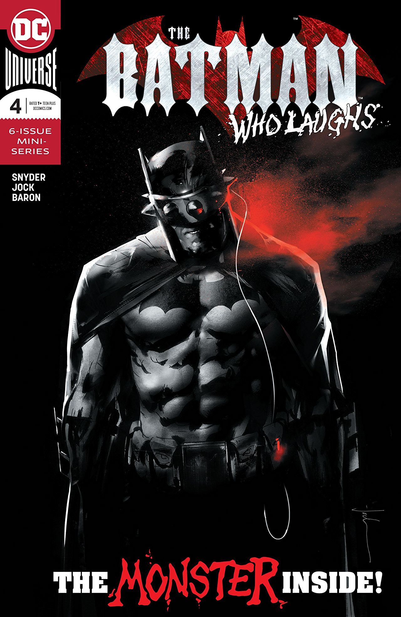
Writer: Scott Snyder / Artist: Jock / DC Comics
It’s been established that this is a book about Batman taking a major L. But if you would have told me that more than halfway through the series, homie would be as down in the dumps as he is, I probably wouldn’t believe you.
Just in case you’ve forgotten, last issue Batman initiated a process that would turn him into a version of the Batman Who Laughs so he can see, smell, hear, and most importantly– think like the dark version of himself that seems to be 20 steps ahead. It was a bold move, and easily one of the darkest decisions Bruce has ever made, but it was a last-ditch effort. Bruce hoped that doing that would level the playing field. All I can say is that the jury’s still out on that.
This issue featured Batman getting his leather wings clipped on a few notable occasions. It opens up with Alfred throwing hands in a scene that felt like it was ripped out of a Greek tragedy. And it closed with a bunch of Black Gate guards emptying round after round on the Caped Crusader. On top of that, every page in between that bloody bookend was filled with Batman getting outsmarted by his evil counterpart.
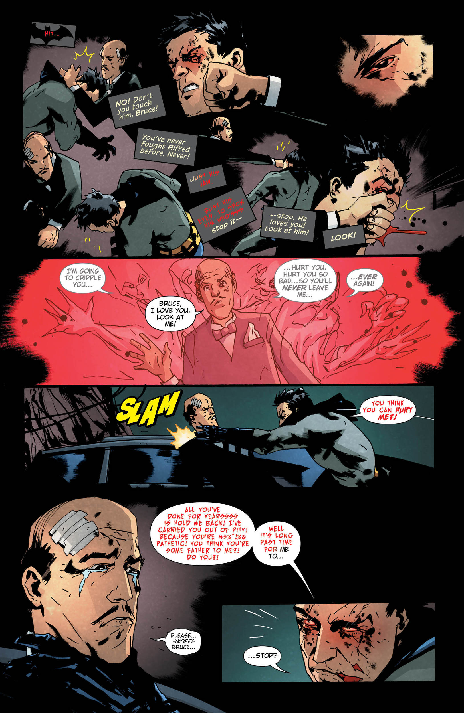
But we did see Bruce take some strides in this issue. As he descends into his own version of the Batman Who Laughs, we get to see his internal struggle in real time as he tries to stave off the infection before it spreads and he’s no longer himself. In those moments where he can shake off the crazy, he gets to use his new abilities to his advantage, seemingly helping him find the clues he needs to stop Laughs.
The MVP of this issue was without a doubt Sal Cipriano who did the lettering. Lettering is an art form unto itself that’s often overlooked. But it’s times like this when the craft shines so bright that it rises to the top of the crop. There are a lot of distinct voices in this series, and the best way to make those voices feel unique and different is to give them different fonts, shades, and colors that correspond to them specifically. The Batman Who Laughs has a red font with a black speech bubble. It gives off an uneasy feeling when you read it. Maybe he’s speaking from the back of his throat. Maybe his words make weird inflections. Then you’ve got the Joker, whose speech bubbles are more freeform and the font less restrictive. This really feeds into Joker’s free-flowing way of speech that captivates the audience. But the real highlight was seeing Bruce’s transformation from Batman to TBWL conveyed through the lettering. In moments where the bad side is taking over, we get that red font. Sometimes a word will start black and end up red & jagged. It really helps us see and hear (in our heads) the many changes that Bruce is going through, and it strengthens the integrity of the stakes.
The Batman Who Laughs #4 highlights Batman’s descent into darkness with its stellar lettering by Sal Cipriano. Snyder and Jock create a story that’s mentally and visually unsettling, but Cipriano’s eerie lettering hits you in the soul.
9.5 Lying Black Gate Guards out of 10
Reading The Batman Who Laughs? Find BNP’s other reviews here.
Want to get Black Nerd Problems updates sent directly to you? Sign up here!
Follow us on Twitter, Facebook and Instagram!
Show Comments